BikeTag Redesign
TL;DR
Summary: BikeTag is a beloved mystery photo tag game played on bicycles. The game is currently played in cities across the world across several different platforms (including Facebook, Twitter, and Reddit) but the BikeTag.io development team wants to create a responsive web app designed specifically for the game that can serve as a hub for BikeTag games. Frequent users of the biketag.io site have a good mental model of the gameplay and site flow, however it is not as intuitive for new users. An evaluation was completed to assess how well the application performed for primary users, then these findings were synthesized into 3 key themes and 3 user stories which remained the focus while the interactive prototype was designed and developed. The resulting application features a simple and intuitive user flow while keeping the original integrity and aesthetics of the current site that users have come to love.
Role: UX Researcher and Designer
Methods: Cognitive walkthrough, evaluative research, remote moderated usability testing, think aloud protocol, contextual inquiry, task analysis, user stories, affinity diagramming, prototyping
Research & Evaluation
Cognitive Walkthrough
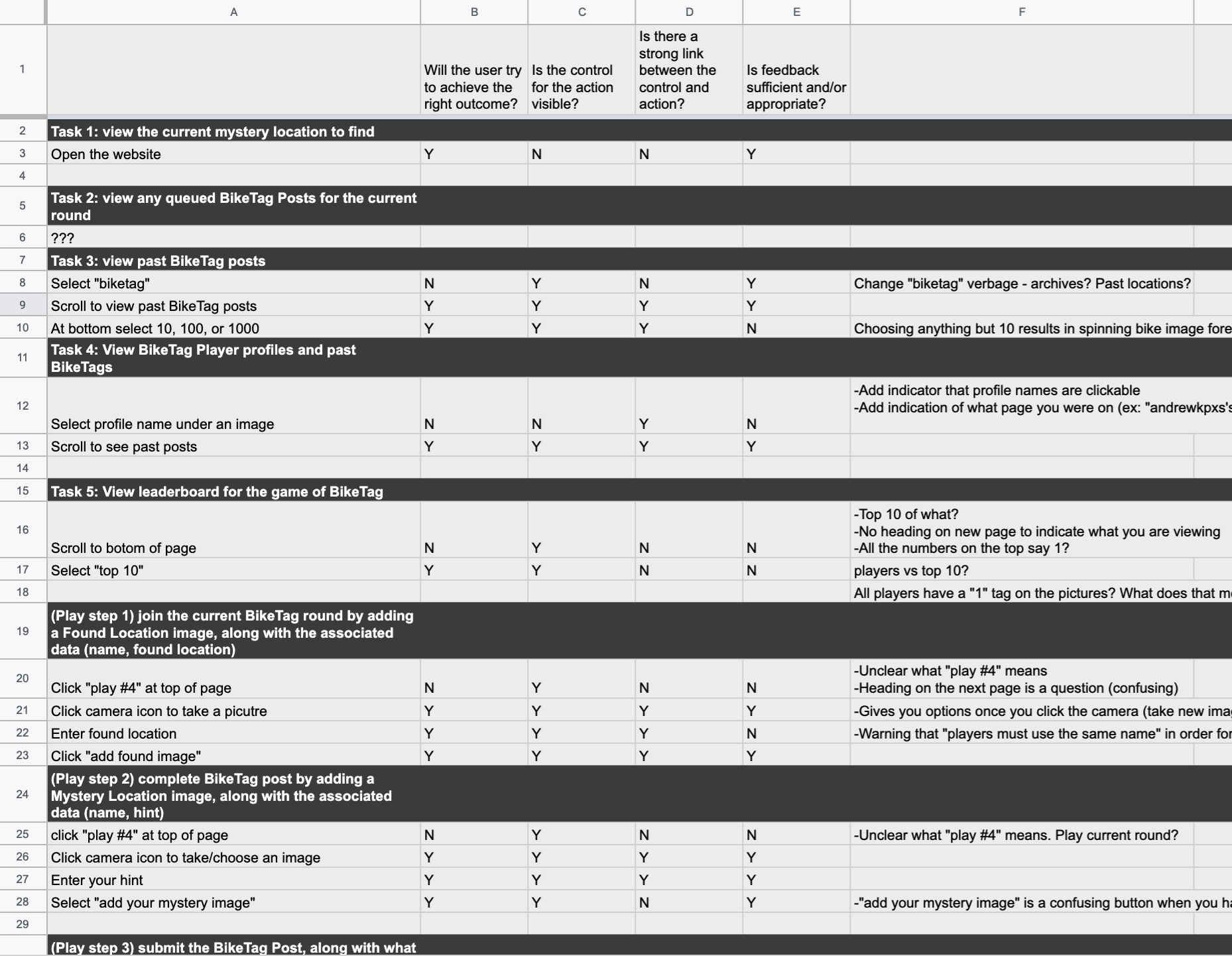
To begin, I needed to get a baseline understanding of the site’s current flow and rules of the gameplay so I first completed a cognitive walkthrough for 8 key user tasks that were defined by the stakeholder. These tasks were analyzed to identify any pain points and I noted if they violated any primary design elements such as hierarchy, consistency, mapping, feedback, visibility, and mental models while answering the following questions:
Will the user try to achieve the right outcome?
Is the control for the action visible?
Is there a strong link between the control and action?
Is feedback sufficient and/or appropriate?
Google Sheets was used to collect and synthesize initial data
Primary User Research
Next, I collaborated with my team to develop a test script for contextual inquiries with our users. Here, our goal was to gain more information on:
Users’ first impression of the site
Which tasks are most important to the user
Identify any pain points in current site flow
Determine the user’s priorities and what excites them about the site
Two hour-long research sessions were completed with users. One was based in Seattle and was familiar with the BikeTag.io site, and another based in Minneapolis who is a moderator of a Facebook BikeTag group. I moderated one session and took notes for my team during the other.
Planning and executing user testing as a brunette team
Moderating user testing
Synthesis & Results
After primary user research was completed, I synthesized results from all the research using affinity diagramming. 3 main themes emerged as areas of focus during prototype design:
Main user flow. Frequent users of the app had a good mental model of the interface however it was not intuitive for a new user
Social Engagement. Overall, players were excited about the game of BikeTag. They enjoy that there is a social aspect (option to share results to social media, meet other people) but don’t want this to be a requirement and would like the option to engage in the app without disclosing any personal information
Labeling and consistency. Users enjoyed all the features of the app however wanted clarification of the content on each page. Overall clarity and consistency could be improved
From here, a plan was developed for the prototype including 3 user stories to guide the focus of interface design.
User Stories
“As an avid cyclist and game player, I want an app that I can open and be able to take/post a picture immediately without clicking around so that I can get back on my bike and keep playing”
— User Story 1
“As a bike commuter, I want to find new landmarks that aren’t on my normal route so that I can get to know all the bike routes around the city.”
— User Story 2
“As a new cyclist, I want a way to connect with other players so I can get to know more people in the biking community”
— User Story 3
Design & Prototyping
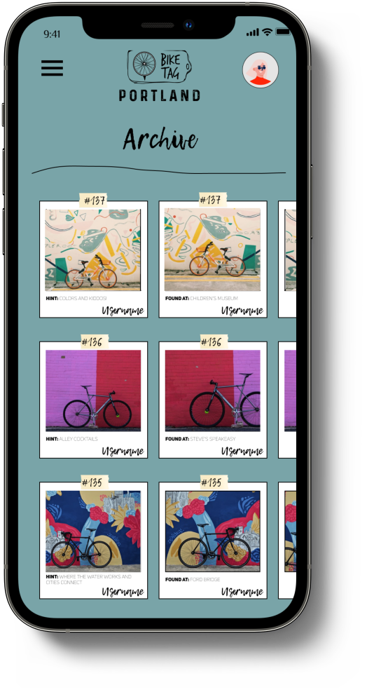
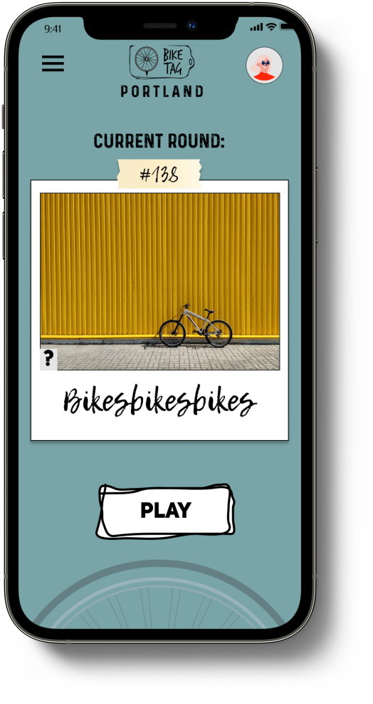
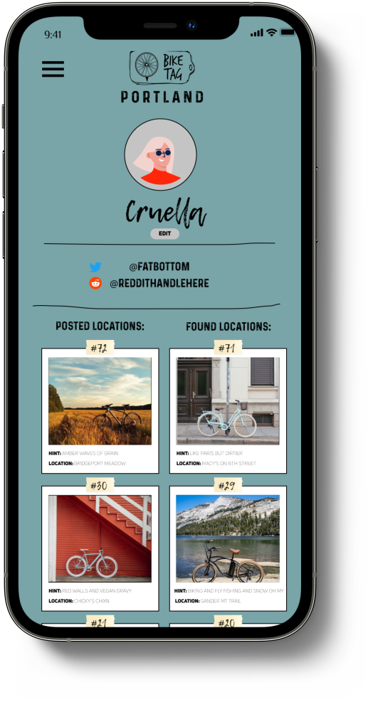
Using the user stories to guide design flow, I started by building a new screenflow diagram. Next, I sketched wireframes of key screens to start visualizing design elements. From those sketches, I created digital version and then a full interactive prototype of key user flows in Figma. Link to the full clickable prototype below!
Next Steps
User testing provided a plethora of information and ideas. Key user flows were built out in the current prototype, and the following are recommended next steps for future research and development:
The rules of BikeTag differ slightly between cities/games/platforms and should be clarified and clearly stated in the rules section
Add “featured streaks” to the archive page. For example, streaks of similar locations like fire stations, libraries, restaurant chains, etc
Additional profile features including badges for certain achievements (posting streaks, etc) and stats from past games
Geolocation/location services for each post
Takeaways
As someone who always enjoys a casual bike ride around the lakes of Minneapolis, this project was an exciting opportunity to get to know another facet of the cycling community and design a service that is designed for and around bikers. The purpose of the app is to get players outside and exploring their city, not to spend time navigating an application with friction and frustration. User testing with biking enthusiasts was an inspiring process and their insights were kept as the main focus in developing the BikeTag.io app to be optimized for users every step of the way.

